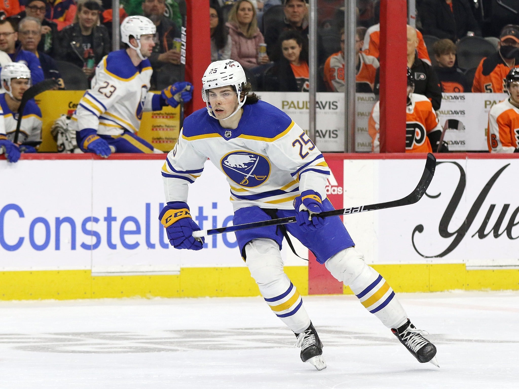
The Pittsburgh Penguins’ recent promo for the 2026 Penguins 6.6K Run and Family Walk featured a logo that has sparked speculation about a possible new jersey because of its blue color scheme, retro skating penguin, and apparent 60th-anniversary mark. There has been no confirmation of a new alternative jersey, but this has prompted a good question: if the Penguins are preparing a blue Hometown Remix or anniversary look, what should that jersey look like? The answer is simple: It should lean into history.
A blue Penguins sweater works because it is connected to the franchise’s roots. A new version would not work if it looks like a merchandise play. Pittsburgh has one of the NHL’s most recognizable logos in black and gold, but the franchise did not begin there. The original Penguins wore blue and white, and any 60th-anniversary look should use that as their foundation instead of treating it like a gimmick.
Penguins Have Real Blue History
The possible Penguins’ jersey hint did not come out of nowhere. Their official uniform history shows that the franchise’s first sweaters featured white and light blue, with “Pittsburgh” written diagonally across the front. The team later moved toward darker blue and eventually switched to black and gold during the 1979-80 season.
A blue sweater would not be abandoning the franchise identity. It would be revisiting the identity the team had before black and gold became permanent. That distinction is important. Pittsburgh fans are protective of black and gold for obvious reasons. The Steelers, Pirates, and Penguins share a color scheme that has become part of the city’s sports culture. Still, the Penguins’ blue era is not fake nostalgia.

The Penguins’ blue and white color scheme lasted for more than a decade, and the history behind black and gold also gives the old colors more context. The move to black and gold helped unify Pittsburgh’s major professional teams, but it did not erase what came before. A 60th-anniversary look should honor both realities.
Penguins Should Avoid a Forced Remix
The risk with any Hometown Remix-style jersey is that the concept can become too clever. The Penguins do not need a design that throws every era into one sweater. They do not need a jersey that mixes the scarf penguin, diagonal lettering, navy blue, powder blue, black, gold, triangles, checker patterns, and anniversary patches. A strong anniversary look should feel intentional, not crowded.
Pittsburgh has already shown that alternates can succeed when the idea is clean. The light blue throwbacks connected directly to the early era, and the later black-and-gold throwbacks worked because they pulled from the franchise’s championship identity. The best designs know what they are trying to say.
A 60th anniversary jersey should say this: the Penguins are celebrating where they started. That means blue should be the point, not the surprise. A retro skating penguin could work if it matches the era being referenced. Diagonal “Pittsburgh” lettering could work if the team wants to connect to the original uniforms. A 60th-anniversary patch could work if it complements the sweater instead of overwhelming it.
The Penguins’ recent alternate jersey rankings show the mixed fan reaction when a design feels like a mashup instead of a clear idea. That should be the lesson. Fans can accept something different if it is rooted.
Crosby Era Can Connect to the Past
A blue anniversary sweater would also create a useful bridge between eras. Sidney Crosby has already worn the blue Penguins throwbacks during his career, which helps connect the modern franchise to its early visual identity. Those jerseys were not part of the Stanley Cup black-and-gold look most associated with Pittsburgh’s championship years, but they still became part of the Crosby-era memory bank.
That helps a 60th anniversary design feel less distant. The original blue belongs to the franchise’s earliest years, but Crosby helped reintroduce that color scheme to a younger generation of fans. A new version could connect the expansion era, the outdoor-game memories, and the current team in one clean look.
Evgeni Malkin is part of that bridge too. He and Crosby have spent their careers carrying the Penguins through the modern era, and a 60th anniversary season naturally invites a broader look at what the franchise has become. The sweater should not only remind people of the first Penguins teams. It should show how far the organization has traveled since then.
That is why the design has to be careful. A jersey can celebrate history without pretending every era was equal. The blue years represent the origin. The black-and-gold years represent the championships. The Crosby and Malkin era represents the modern standard. A smart anniversary look can nod to all of that without trying to cram every idea into the crest.
Blue Should Feel Like a Celebration
The Penguins are entering a season where the on-ice product still has questions. The roster is changing, the prospect pool is being rebuilt, and general manager Kyle Dubas is trying to balance the final years of the veteran core with the team’s younger future. A strong anniversary jersey cannot solve any of that. It can, however, give the season a clearer identity.
The Penguins’ biggest games in 2026-27 already include rivalry matchups and home dates that should carry extra energy. A blue anniversary sweater would give the team an easy way to turn certain nights into franchise events. The home opener, Philadelphia Flyers games, Washington Capitals games, or a designated 60th-anniversary night would all be appropriate events to wear it.
That is where the jersey can become more than merchandise. It can become a theme for the season. The Penguins do not need to wear blue constantly, but selective moments would make the sweater feel special.
The team has done this before with alternates that connect to specific memories. The history of outdoor jerseys shows how powerful a well-executed throwback can be when it feels tied to a larger moment. Pittsburgh has enough history to do the same with its 60th anniversary.
Penguins Need the Right Kind of Nostalgia
Nostalgia can be lazy when it only asks people to remember. It is stronger when it helps explain why something still fits.
That is the challenge for the Penguins. A blue sweater should not be treated as a costume from another era. It should be presented as part of the franchise’s full story. Pittsburgh began in blue, found its permanent civic identity in black and gold, and then became one of the NHL’s defining organizations through Mario Lemieux, Jaromir Jagr, Crosby, Malkin, Kris Letang, and multiple championship teams.
A 60th anniversary season is the right time to connect those pieces.
The possible 6.6K logo hint may end up being exactly that: a hint. Until the team officially releases anything, the jersey conversation remains speculation. Still, the direction makes sense if Pittsburgh handles it with restraint. Blue can work. The scarf penguin can work. A 60th-anniversary patch can work. The key is making sure the design feels like a tribute, not a novelty. If the Penguins are going back to blue, they should go all the way back to the reason it belongs.
They should lean into history.
Free Newsletter
Get Pittsburgh Penguins coverage delivered to your inbox
In-depth analysis, breaking news, and insider takes – free.
Subscribe Free →