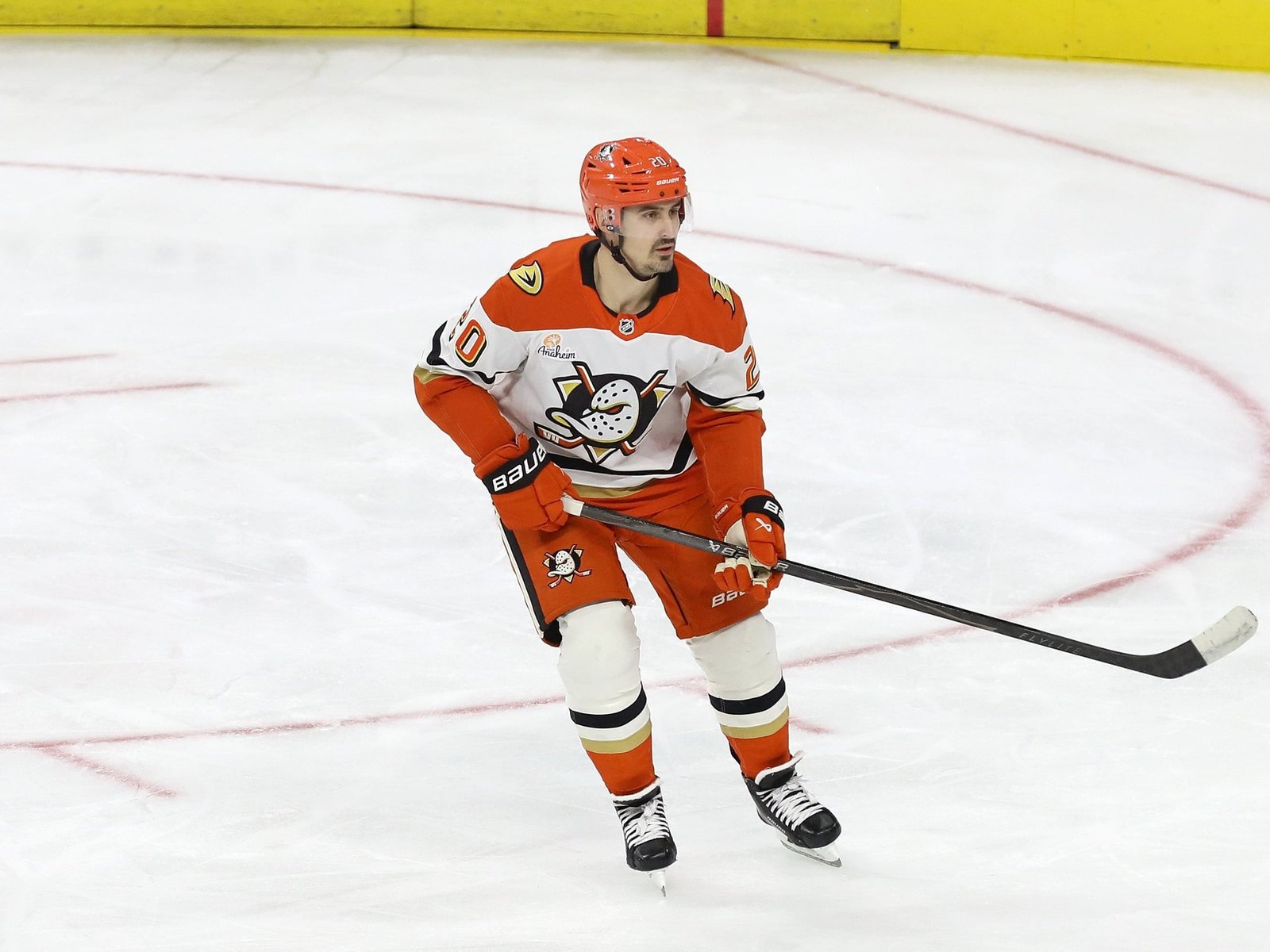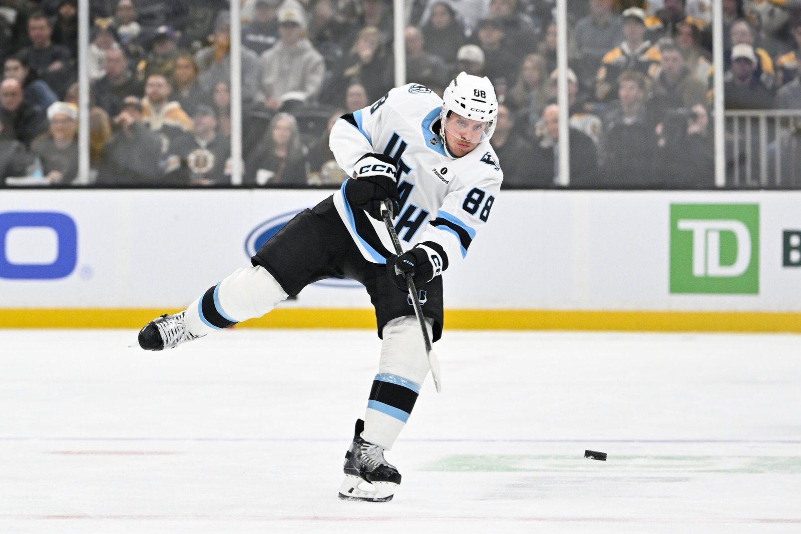
It’s official now. On Wednesday, the NHL announced its Hometown Remix uniforms. As in MLB with City Connects and the NBA with City Editions, NHL teams will have a uniform uniquely designed that “authentically celebrates the fans, city and local culture of each team.”
Naturally, my immediate thought was what the Tampa Bay Lightning’s new uniforms will look like. First, I’ll consider the core idea of the uniforms, their authenticity to the city, and then offer two ideas that make sense.
First, a Discussion on NHL’s Hometown Remix Authenticity
While I’ll discuss the look of the uniforms, the reality is that there’s no knowing what they might look like. Fellow local team, the Tampa Bay Rays, and their MLB City Connects uniform is a good example.
The neon colors of green and purple are a nod to their early Devil Rays years. That part makes sense, as well as the use of the Skyway Bridge and a pelican in the branding. However, what stood out was the tribute to skateboarding culture. Look, maybe I was out of touch about this as a local. Maybe it’s the same for much of my hometown social circle. This choice, specifically, was a surprise. It felt like a very niche target market.
St. Petersburg has some large skate parks. This isn’t to say nobody skates – many do. However, that is different from it being baked into the city’s cultural identity. I get it. Using beaches and sunshine all the time can be lame. Using cigar-making from over in Tampa was likely a non-starter. It just seemed odd for the Rays’ theme. At least everyone got Evan Long-board-ia out of it.
This brings us back to the Lightning. I don’t want to see something too niche, but on the flip side, Gasparilla has been used to death. It’s been used for warm-up jerseys multiple times, and it was, rightfully, the theme of the Stadium Series. Trying something different would be great, even if it means not using the most famous thing about the city. Yes, it would make “authentically” celebrating the city harder. However, they’re overdue to try.
What We Know About the Lightning Hometown Remix So Far
If the leaked color scheme put out by Icethetics in June is the correct one, most fans will be excited. The uniform would be black. Fans love it when this team pulls an Amy Winehouse and goes Back to Black.

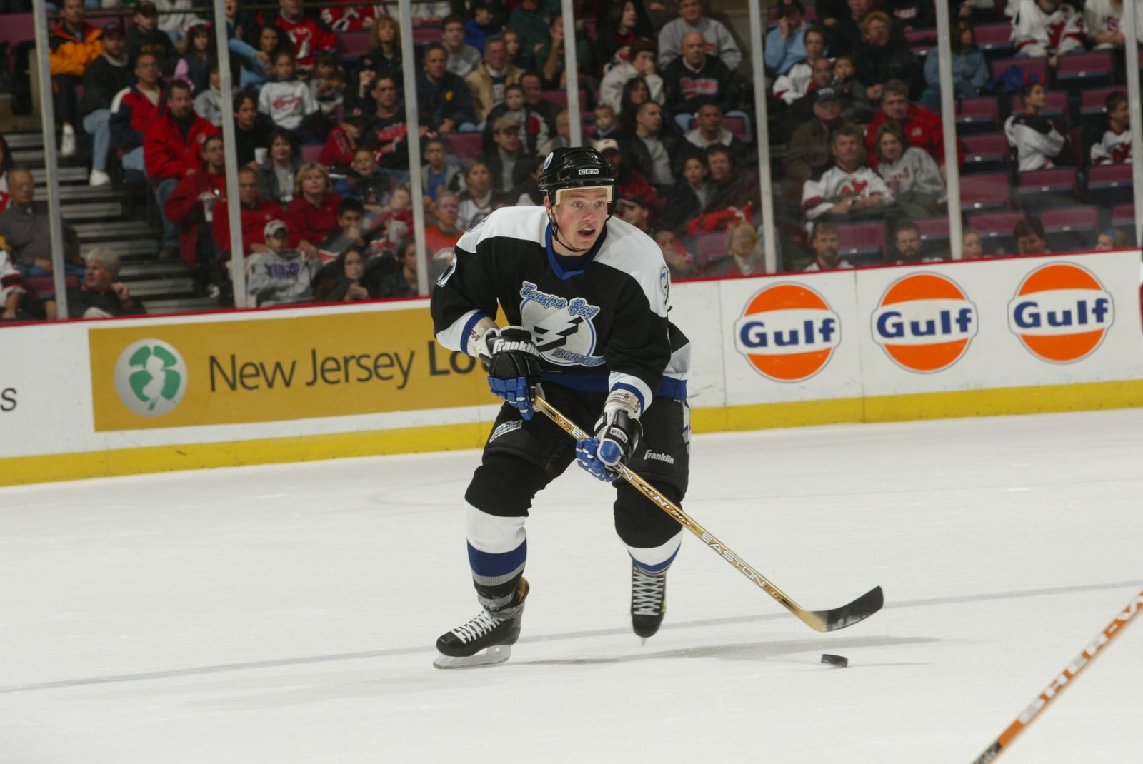
It wouldn’t be the first time in recent years that the Lightning paid homage to their original look. Both reverse retros featured the original logo. The first one was a tribute to the 2004 Stanley Cup-winning uniforms. The latter was a nod to the infamous storm jersey from the 1990s. Even the recent black third jersey technically counts. It used the shoulder patch instead of the retro logo, but it was made clear that the intention was a tribute.
However, there is always a chance the leaked info was wrong. Icethetics usually isn’t that far off, but the odds are higher than zero. A completely different color could be used, and then all expectations would go out the window. For now, we can count the colors as something we know and attempt to interpret the possibilities.
What Would Make the Most Sense for the Lightning?
It might be a biased pick, but a throwback would be the best choice. Almost everyone loves throwbacks, and that would be welcomed with open arms. That said, if they find an alternative that embodies Tampa, that would also be great. Beyond Gasparilla, there may be a solid option: a nod to the old metal scene, as in thrash metal or death metal music, that was huge in the 1980s and 1990s.
In 2018, an article in the Tampa Bay Times stated that “Tampa became to death metal what Nashville is to country music and New Orleans is to jazz” (from ‘Death metal pioneers seek site to replace Temple Terrace studio,’ Tampa Bay Times, Jan. 3, 2016). Being compared to Nashville and New Orleans and their iconic status as music cities is no small statement. If you have a favorite death metal band, there is a solid chance they came from or made a stop through Tampa.
A metal band theme would still work really well with the primary black color too. A color significant to the team and significant to death metal would be too perfect. Should they want to tone it down to just metal bands in general, that’s fine. Trans-Siberian Orchestra is arguably the biggest band to come out of Tampa, and they’re a different type of metal entirely.
This is simply one of two ideas that could make sense. The more profitable idea would be the throwbacks, and that isn’t a bad thing. However, the edgier concept would be a nod to rock n roll. Thunderstruck won’t be a heavy enough sound for this one. In the end, they’d be encouraging fans to rock on, and that idea, well, rocks.
Free Newsletter
Get Tampa Bay Lightning coverage delivered to your inbox
In-depth analysis, breaking news, and insider takes – free.
Subscribe Free →